
Strategy, engagement & creative direction for mission-driven organizations.
I partner with executive leadership to build awareness, strengthen stakeholder engagement, and create communications strategies that advance institutional goals, inspire support, and drive measurable impact.
In my estimation, what makes Jon such an exceptional designer is his capacity to listen. He seeks to understand long before he puts pen to paper. Jon is a joy to work with and a state servant.
Randal Dietrich, Executive Director, Minnesota Military & Veterans Museum at Camp Ripley

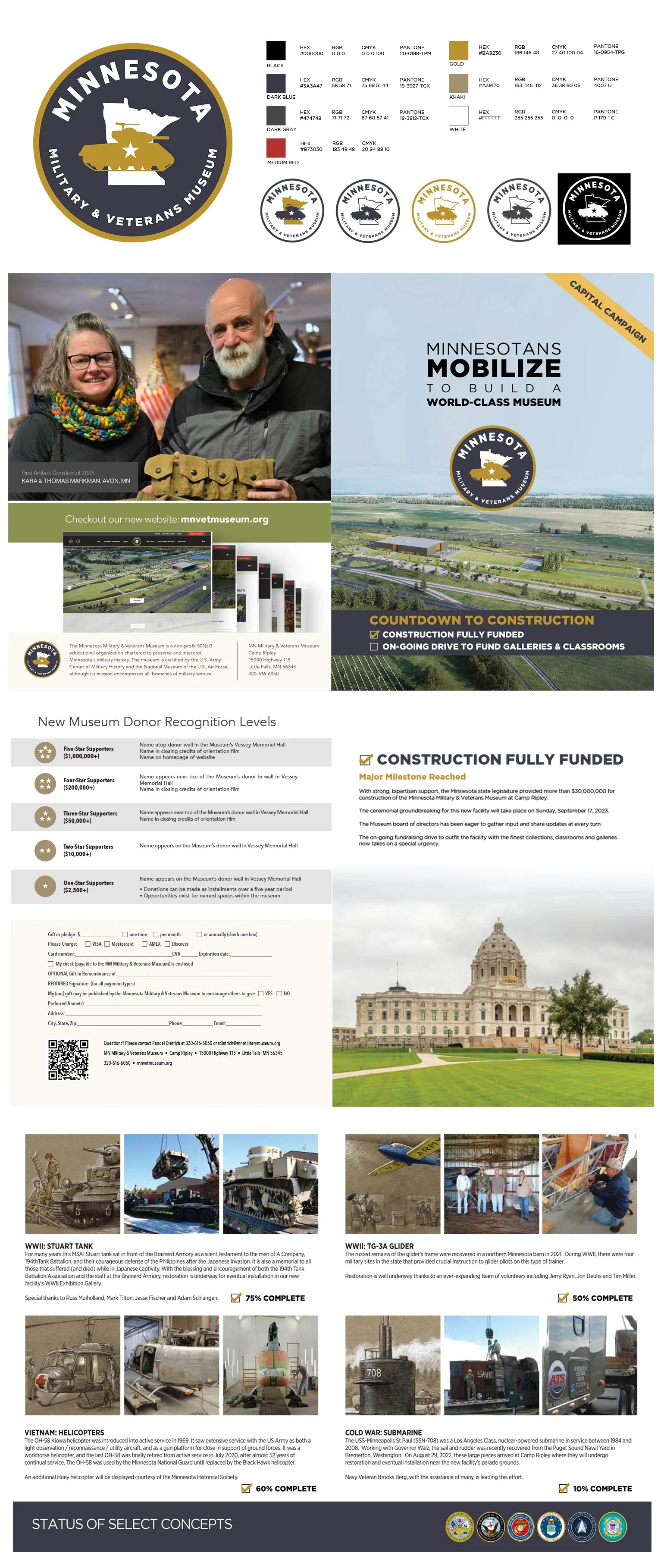
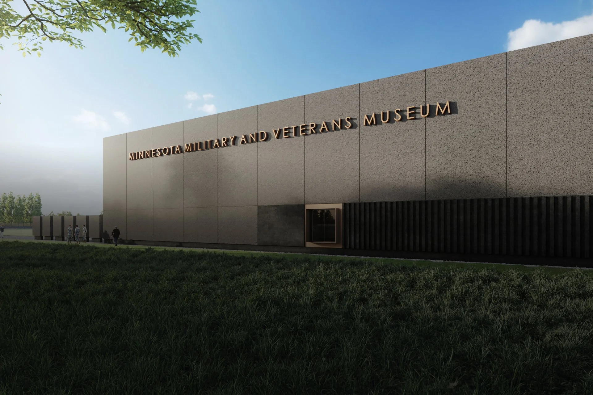
Capital Campaign and Branding
Minnesota Military & Veterans Museum — http://mnvetmuseum.org
Overview
Develop the entire visual identity and campaign materials with the Executive Director Randal Dietrich of the Minnesota Military & Veterans Museum. This includes materials for a capital campaign, supporting the construction of a new museum set to open in the summer of 2026.
Challenges & Opportunities
With minimal staff and a large-scale fundraising goal, the campaign required tailored messaging for a wide array of stakeholders—including the Minnesota State Legislature, Governor’s Office, private donors, and federal partners. The campaign's extended timeline (5+ years) also demanded consistent, evolving materials.
Approach
Partnered closely with the Executive Director to create a cohesive logo, style guide and campaign materials for print, digital, video, and event signage. Materials were designed to be flexible yet unified, supporting everything from legislative presentations to donor engagement.
Results
Brand successfully implemented. Campaign materials had a critical role is raising funds. As of now, the majority of funds have been raised, with the museum on track to open in 2026.
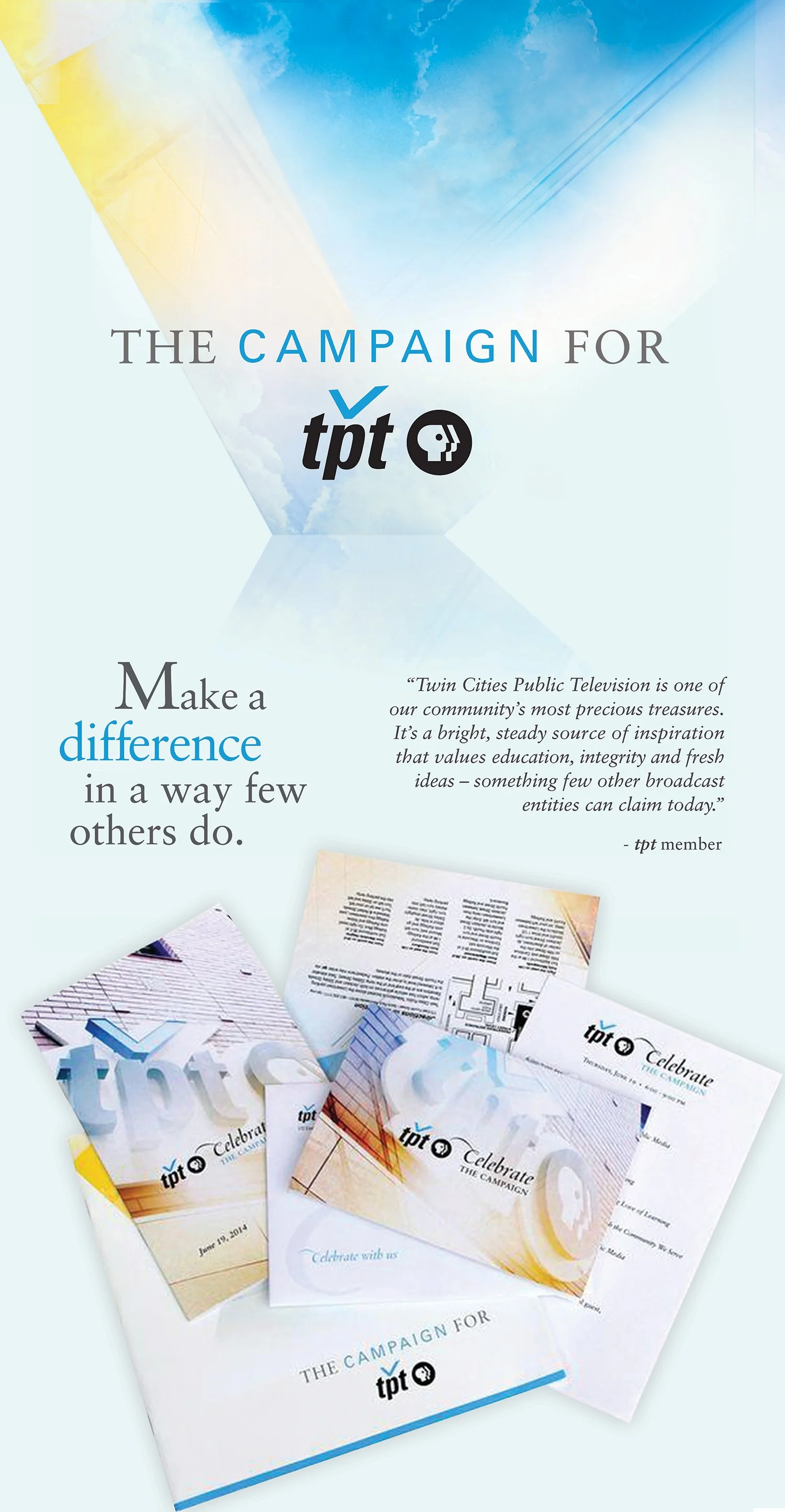

Capital Campaign and Branding for TPT
$30 million capital campaign and rebrand for Twin Cities PBS
Overview
Create the visual identity for Twin Cities PBS’s $30 million capital campaign, which funded six major initiatives, a complete rebrand, and the full renovation of the TPT headquarters in 2015. The goal was to modernize the organization and improve public accessibility both online and on-site.
Challenges & Opportunities
The multi-year campaign involved a wide range of stakeholders—senior leadership, donors, architects, elected officials, and the campaign manager—each with unique priorities. The challenge was to unify messaging across print, broadcast, digital, and event materials over the two-and-a-half-year effort.
Approach
As Art Director, I collaborated with our in-house Creative Services team and stakeholders to develop a distinct visual system. The design was shaped by input from senior leadership, with an emphasis on inspiring clarity across all media.
Results
The campaign surpassed its fundraising goal, resulting in a successful rebrand and the transformation of TPT’s physical space.

City of Minnetonka Communications
Print and digital materials for citywide outreach and public information in 2025.
Overview
Created a cohesive set of communications for the City of Minnetonka in collaboration with Communications Director Andrew Wittenborg. The projects included the Minnetonka Public Works Fall Newsletter, a Car Seat Safety Checkupcampaign with Children’s Minnesota, and an Affordable Housing Cost Analysis one-sheet developed for the Minnesota State Legislature in support of bonding requests.
Approach
Each piece served a unique audience—residents, families, or policymakers—yet shared a consistent civic tone and design system. I worked closely with Andrew Wittenborg to ensure the city’s messaging was accessible, trustworthy, and visually aligned with its established brand. The housing one-sheet distilled complex cost data into clear visuals for legislators, while the newsletter and community flyer emphasized readability and local engagement.
Results
The materials advanced Minnetonka’s commitment to transparent, community-focused communication. The legislative one-sheet effectively conveyed key funding challenges, while the newsletter and outreach campaign helped strengthen public awareness and trust. Together, these designs demonstrate how thoughtful visual communication can bridge civic, community, and state-level audiences.


PBS Kids Hero Elementary Impact Report
20-page printed booklet for the PBS KIDS series
Overview
Design a 20-page impact report for Hero Elementary, a PBS KIDS series, aimed at stakeholders and funders.
Approach
With the brand aesthetic already in place, I collaborated closely with the Executive Director Joan Freese and her team to gather assets and shape the design around the content.
Results
The final report was vibrant, engaging, and informative—tailored for partners including Twin Cities PBS, the U.S. Department of Education, ABCmouse, and Target Corp. It was printed on 80# gloss paper and saddle-stitched for a polished finish.


City of Minneapolis Multilingual Food Safety Flip Book & Posters
Multilingual educational materials for the City of Minneapolis, Hennepin County, and the University of Minnesota
Overview
Design a bilingual dry-erase flip book and poster series to promote food safety among restaurant workers in the Minneapolis–St. Paul area. Develop in English and Spanish and the materials needed to support the goal of reducing foodborne illnesses and strengthen the relationship between food inspectors and restaurant staff.
Challenges & Opportunities
The project required alignment across multiple health departments. In addition to meeting regulatory standards, the content needed to be visually engaging and culturally accessible, with carefully selected images to support key checklist items.
Approach
Collaborated closely with English and Spanish-speaking stakeholders through regular in-person meetings to ensure clarity and accuracy. The project concluded with a final presentation and approval from all parties before going to print.
Results
Hundreds of spiral-bound flip books were distributed to food workers throughout the region. The initiative led to a measurable reduction in foodborne illnesses and helped build trust between health officials and the restaurant community.
With Jon’s expertise, we successfully integrated content from an extensive multicultural and multilingual campaign. He gathered input directly from business operators and transformed it into a highly visual “flip book” guide and accompanying poster set for public health emergencies. Jon's ingenuity was evident not only in the accessible design—crafted to communicate essential information across language barriers—but also in the durable, weather-resistant materials, making the guide suitable for challenging emergency environments.
This guide was so effective that it was adopted by the State of Minnesota and later used in national disaster preparedness efforts. Additionally, Jon created a food protection self-audit guide, which was translated into 15 languages to serve a wide range of users.
Beyond his artistic talents, Jon is also a skilled writer and communicator. His success is rooted in his deep commitment to understanding both his clients and their audiences. I give Jon my highest endorsement as a professional of exceptional integrity, creativity, and authenticity.
Tim Jenkins, Environmental Supervisor for the City of Minneapolis
SnowGlobe Public Relations is incredibly grateful for the design expertise Jon Von Amber brought to the DAV of Minnesota Annual Report. His ability to translate complex content into a visually compelling and accessible publication was nothing short of outstanding. The Centennial issue, in particular, captured both the significance of our 100-year history and the forward momentum of our mission.
This project carried special meaning for Jon, as his own father is a member of DAV. That personal connection was evident in the care, creativity, and thoughtfulness he poured into every page. The result is more than just a report—it is a lasting tribute that honors our past, reflects the values of our members, and inspires our future.
Anna Long, SnowGlobe Public Relations
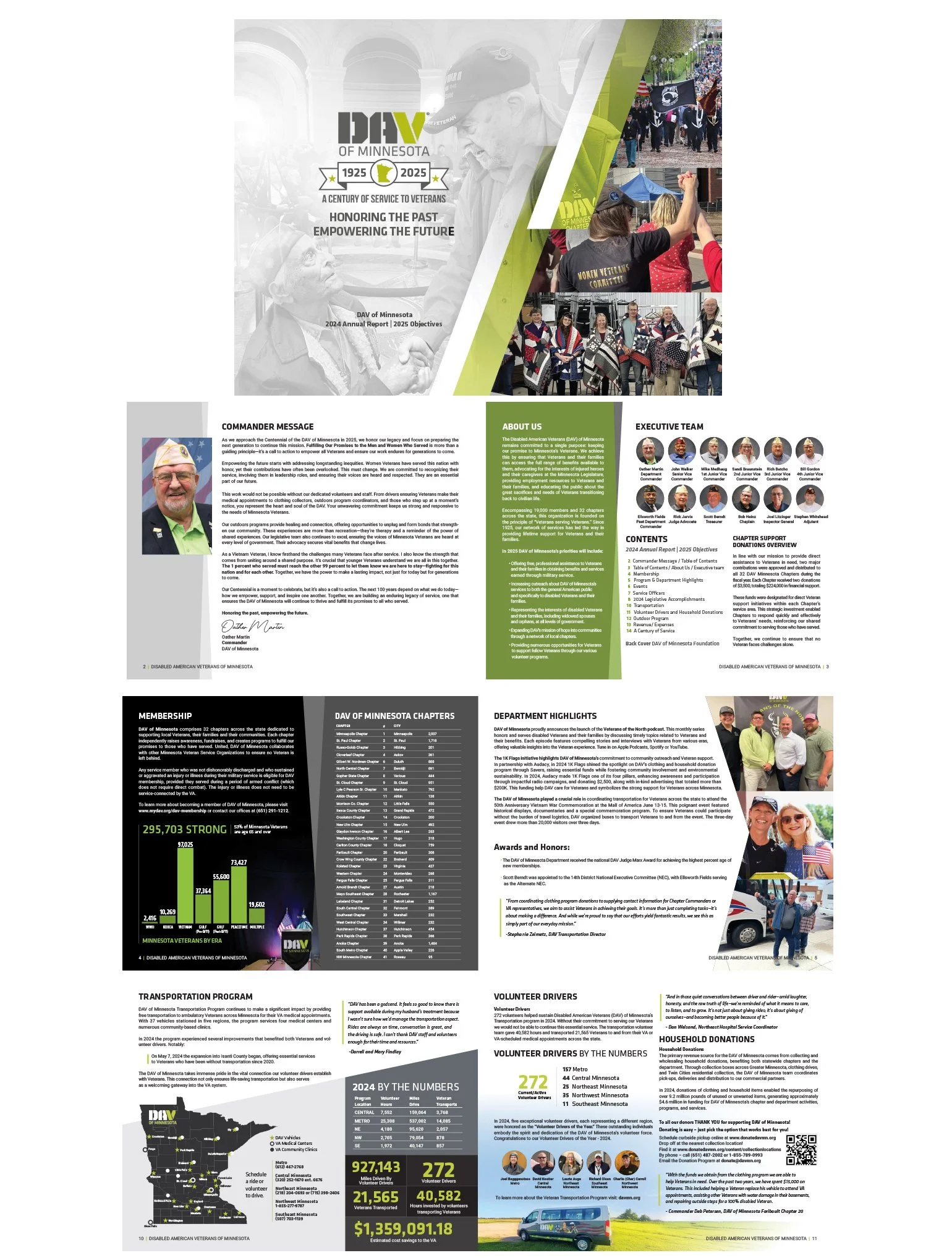
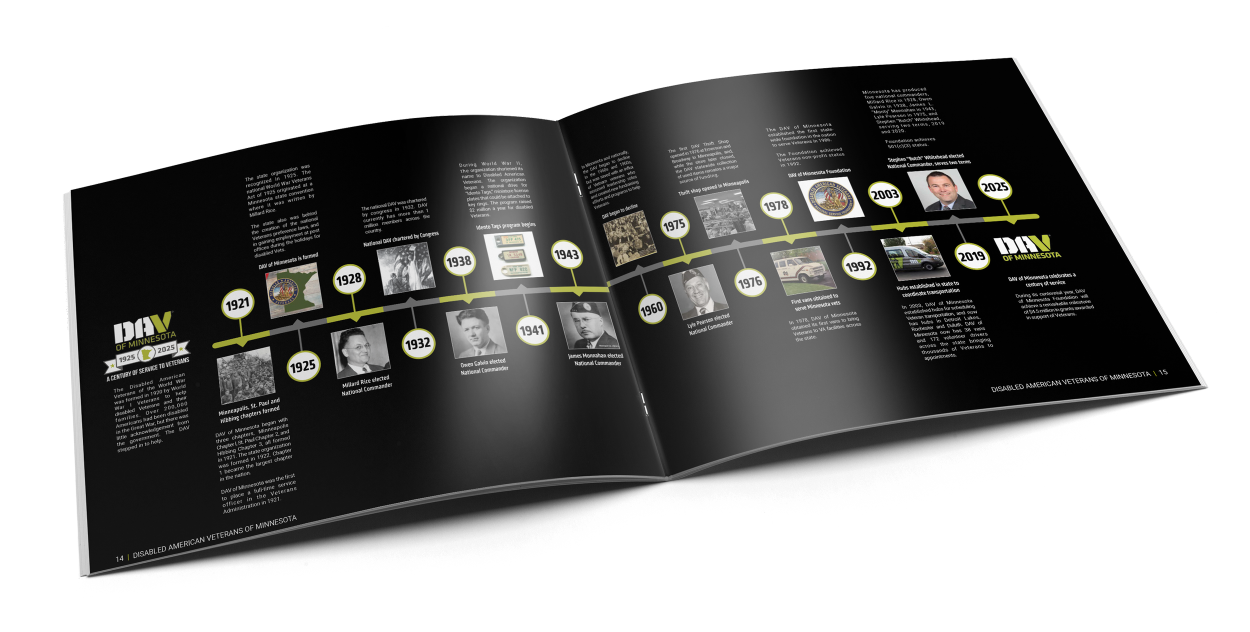
DAV of Minnesota 2024 Annual Report & 2025 Objectives
DAV of Minnesota & DAV of Minnesota Foundation – 100th Anniversary Edition
Overview
Design a special 24-page landscape-format annual report for SnowGlobe PR, the DAV of Minnesota and its Foundation, commemorating 100 years of service. The unique “rotate 180” design needed to feature the DAV content in the first 16 pages, with the DAV Foundation section accessible by flipping the booklet over, covering the remaining 8 pages.
Challenges & Opportunities
The project had a tight six-week timeline and a firm delivery deadline for the DAV Commander and Foundation Executive Director. Working under the direction of SnowGlobe Public Relations, key visual elements included a custom-designed 100-year timeline. The rotated layout required a print partner experienced with this specialized format.
Approach
Proposed a landscape layout to better showcase visuals and timeline content. Worked closely with all stakeholders to ensure accuracy, cohesion, and impact, while partnering with a trusted printer to handle the unique format.
Results
The final saddle-stitched, 24-page booklet received high praise for its design and execution. Anna Long at SnowGlobe Public Relations was thrilled with the result. She was fantastic and grateful to be part of her project. https://www.snowglobepr.com Though the unique format increased print costs slightly, it successfully marked the 100-year milestone and stood out as a memorable piece.

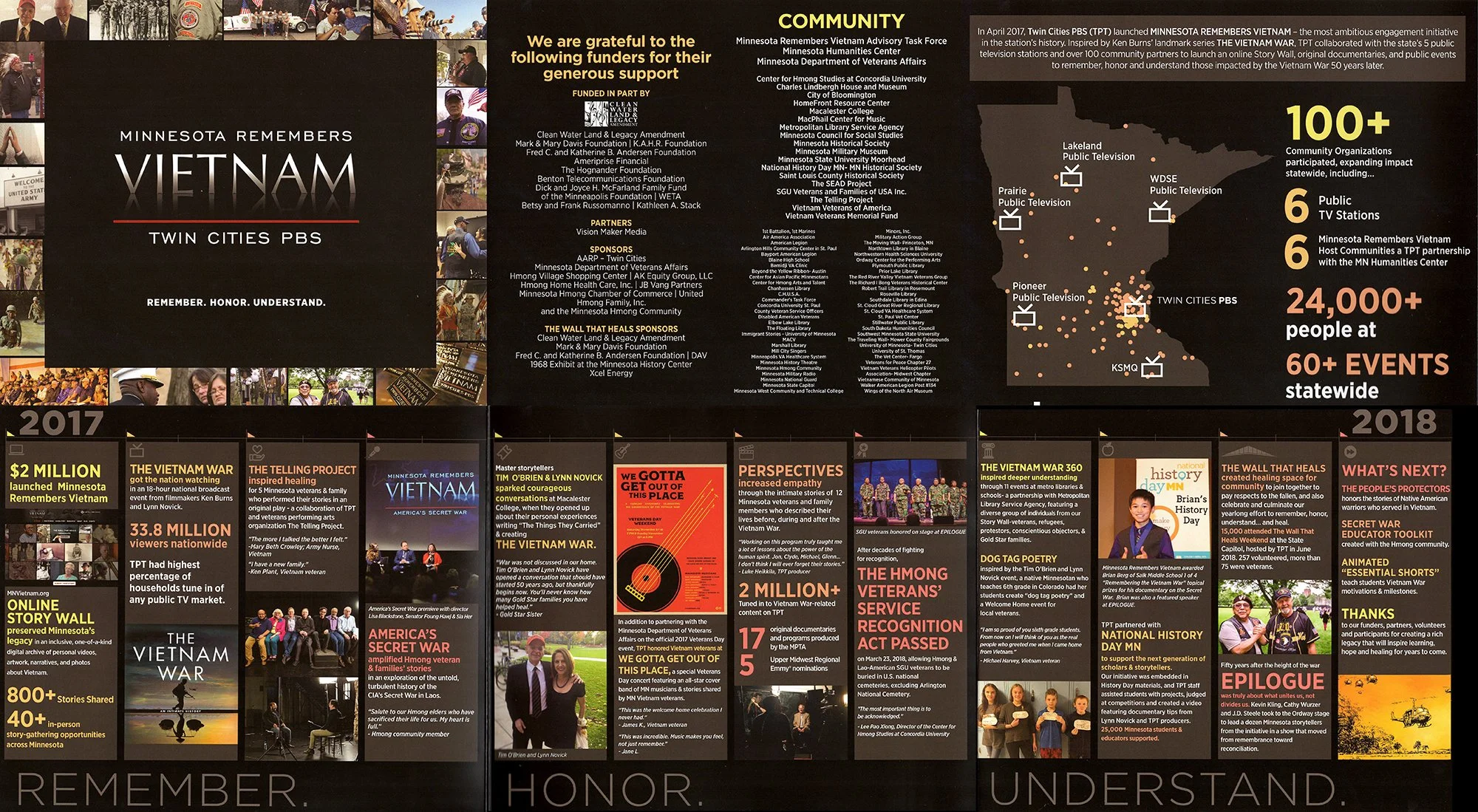
MPTA Community and Legislative Impact Report
Minnesota Remembers Vietnam – By the Numbers
Overview
Design a six-panel, bi-fold impact report showcasing the statewide reach and outcomes of the Minnesota Remembers Vietnam initiative by Twin Cities PBS.
Challenges & Opportunities
The project involved consolidating a large volume of data. I collaborated closely with the Project Manager and Project Coordinator to organize, interpret, and present the information in a clear and compelling way.
Approach
This report was part of a larger branded campaign. I led the visual design, ensuring consistency with the initiative’s established identity while making the data easy to navigate and visually engaging.
Results
Printed on 100# gloss paper, the final piece was both striking and accessible. It was used effectively to communicate impact to donors, legislators, and senior leadership.
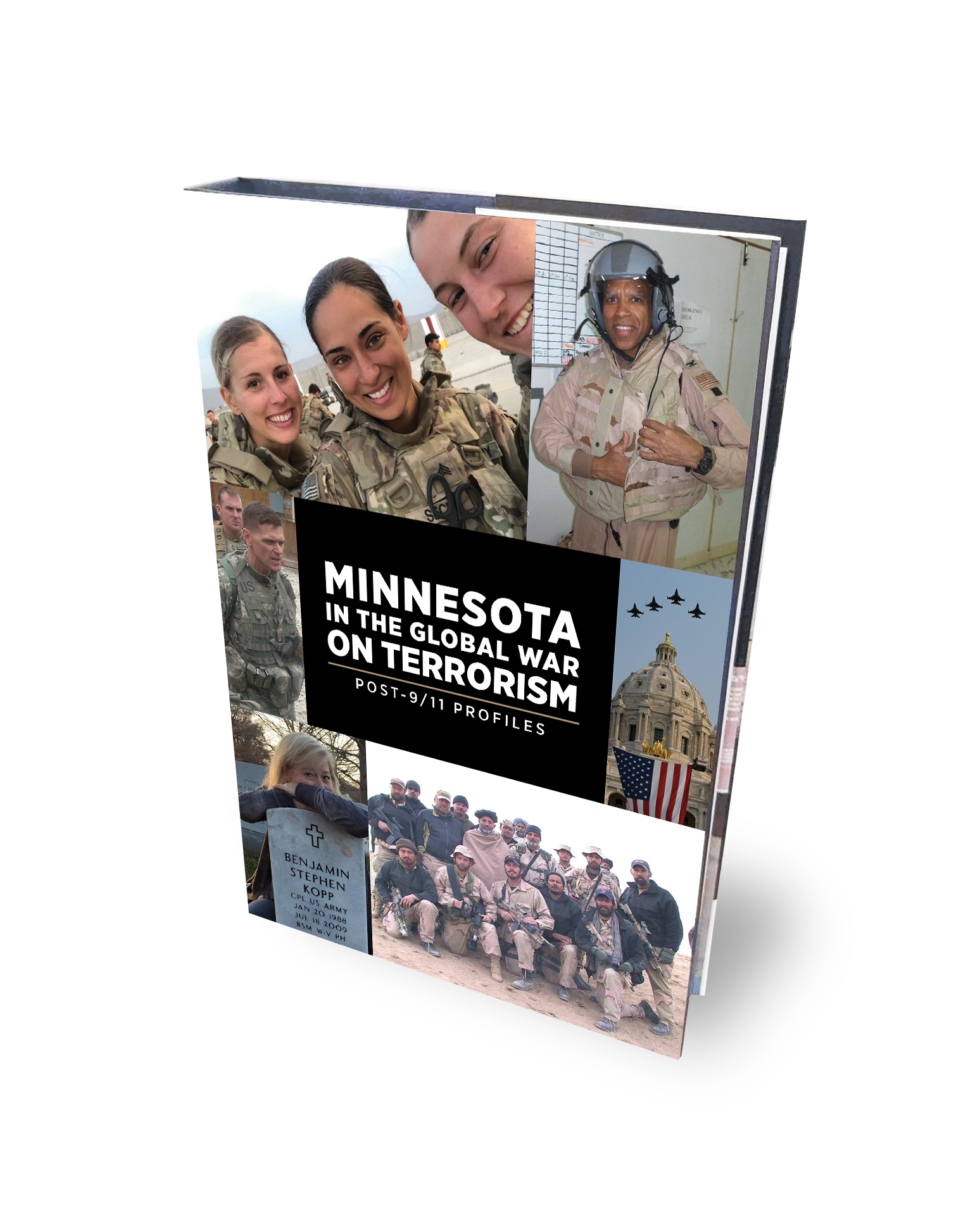
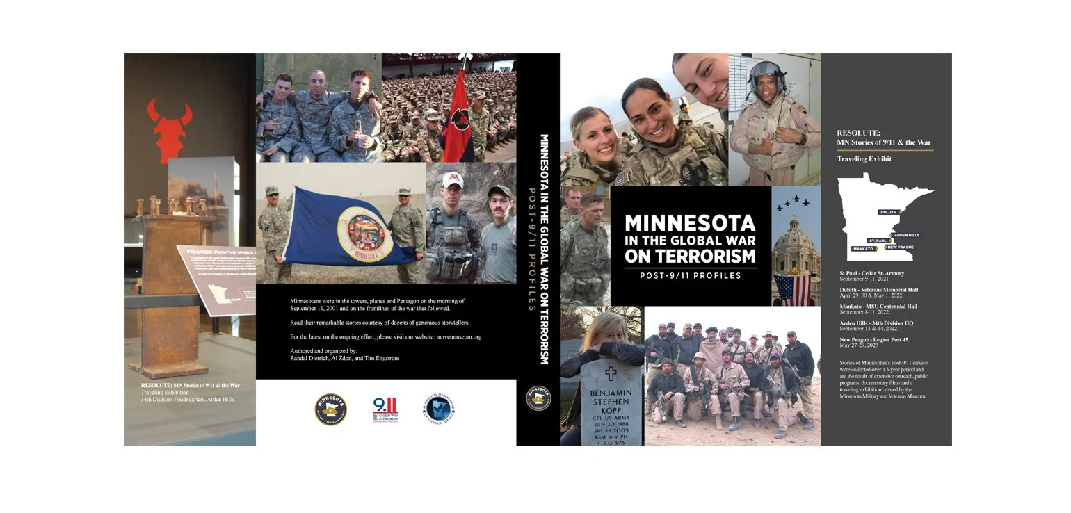

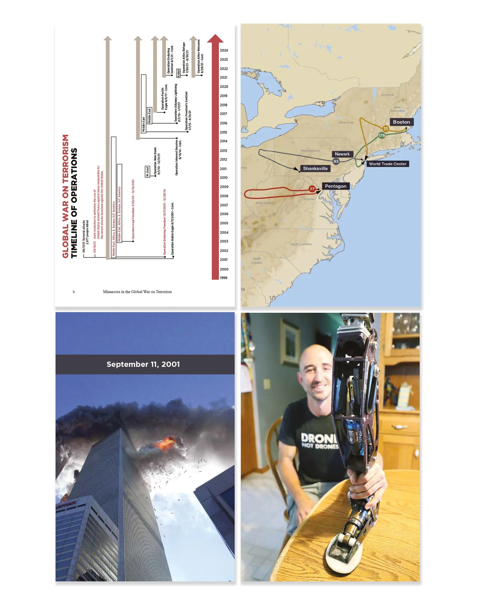
State of Minnesota Commemorative Book
404-page hardcover and e-book for the Minnesota Military & Veterans Museum and the State of Minnesota.
Overview
Layout and design for a comprehensive book and e-book documenting Minnesota’s contributions to the Global War on Terror (2001–present). The State of Minnesota has a book for each of the wars Minnesota has been a part of since the Civil War. This first edition was to be distributed to libraries across Minnesota, with the e-book available through the museum’s website.
Challenges & Opportunities
With just 4–5 months to complete the project under grant deadlines, the team had to blend 80+ personal stories, create custom maps and graphics, and maintain an efficient workflow. A detailed Table of Contents and index were essential for accessibility, along with finding a print partner to ensure long-lasting quality..
Approach
We collaborated virtually, using InDesign’s automated TOC features to keep chapters and page numbers in sync. To create consistency across varying story lengths, images were placed mainly on left (even-numbered) pages, offering readers a visual rhythm and clear chapter cues.
Tools
Adobe InDesign, Illustrator, Photoshop, Google Docs, Flickr, Zoom
Results
A beautifully produced 404-page hardcover book with a dust jacket and a companion e-book.
Credits
Project by Randal Dietrich, Executive Director
Design by Jon Van Amber
Editing by Brian Horrigan
Foreword by Dr. Kyle Ward
ISBN 979-8-218-24425-5 | First Printing: 2023 | Printed in the USA


Product Catalogue Redesign
Trophies, plaques, and recognition items
Overview
Redesign the primary product catalogue for a new ownership group of a business that specializes in manufacturing trophies, plaques, and recognition items. The catalogue was needed for both print and digital formats.
Challenges & Opportunities
They wanted to showcase a wide range of products with varying technical specifications. The consumers of this catalogue were businesses and individuals. Establishing clear technical information in the layout was essential. While older catalogues provided reference points, the goal was a complete visual and structural overhaul, informed in part by competitor research.
Approach
Focused on understanding the new owners’ vision and priorities through consistent communication. Every design decision was grounded in their goals for clarity, usability, and brand refresh
Results
Delivered a fully reimagined, professional catalogue that the owners felt captured the new direction of their business—marking a strong start to their next chapter.
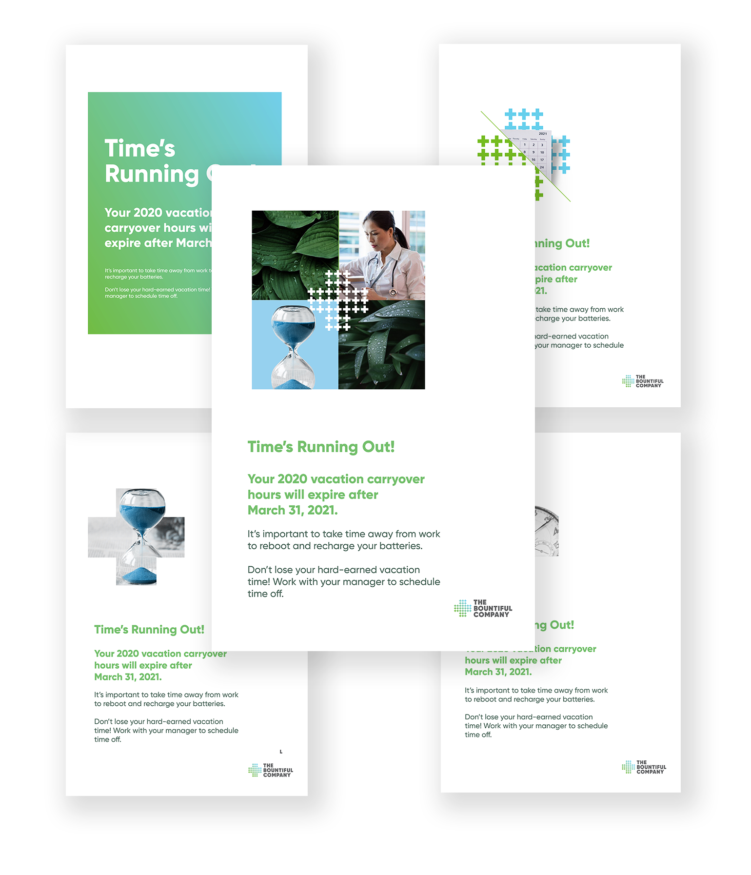
Internal Communications Support
The Bountiful Company (Nature’s Bounty, a Nestlé brand)
Overview
Provide design support for internal communications and select social media assets for The Bountiful Company, known for Nature’s Bounty products. This included hundreds of materials including posters for use in their production facilities.
Challenges & Opportunities
The key challenge was integrating with the in-house Marketing Department to align with their established brand and messaging while enhancing their existing communication efforts.
Approach
Collaborated directly with the Marketing Manager and team to ensure brand consistency and meet evolving internal communication needs.
Results
Delivered hundreds of designs for both internal and external use. Print-ready files were provided to the client for in-house production and distribution.


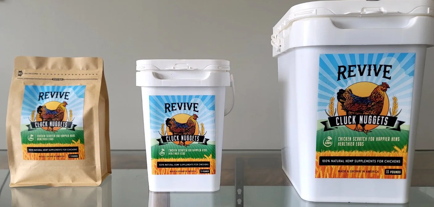
Branding & Packaging Label Design
REVIVE – Hemp Supplements for Chickens
Overview
Create the brand identity and product packaging for Revive, a new line of hemp-based supplements for chickens. The goal was to craft a cheerful, eye-catching aesthetic that stands out both on shelves and online, setting the tone for future product lines.
Challenges & Opportunities
Well, this was a new category for me, which made the project especially exciting. The visuals needed to align with the team’s marketing research and convey approachability and energy. The client team was new, highly motivated, and open to creative collaboration.
Approach
Partnered closely with the Marketing Manager through virtual design sessions on Google Meet. She relayed our progress to the broader team and owners, streamlining feedback and decision-making.
Results
The owners of the business were thrilled with the design and will be applied to both paper and plastic packaging of different weights. The consistent, enthusiastic response confirmed the brand direction is resonating—with more products to follow.
“They don't get much better than Jon. His keen eye for detail, mixed with incredible knowledge and innate creativity makes him golden! And he's super nice...ALL the time!”
Rebecca Kolls, TV personality, producer, gardening expert, meteorologist